
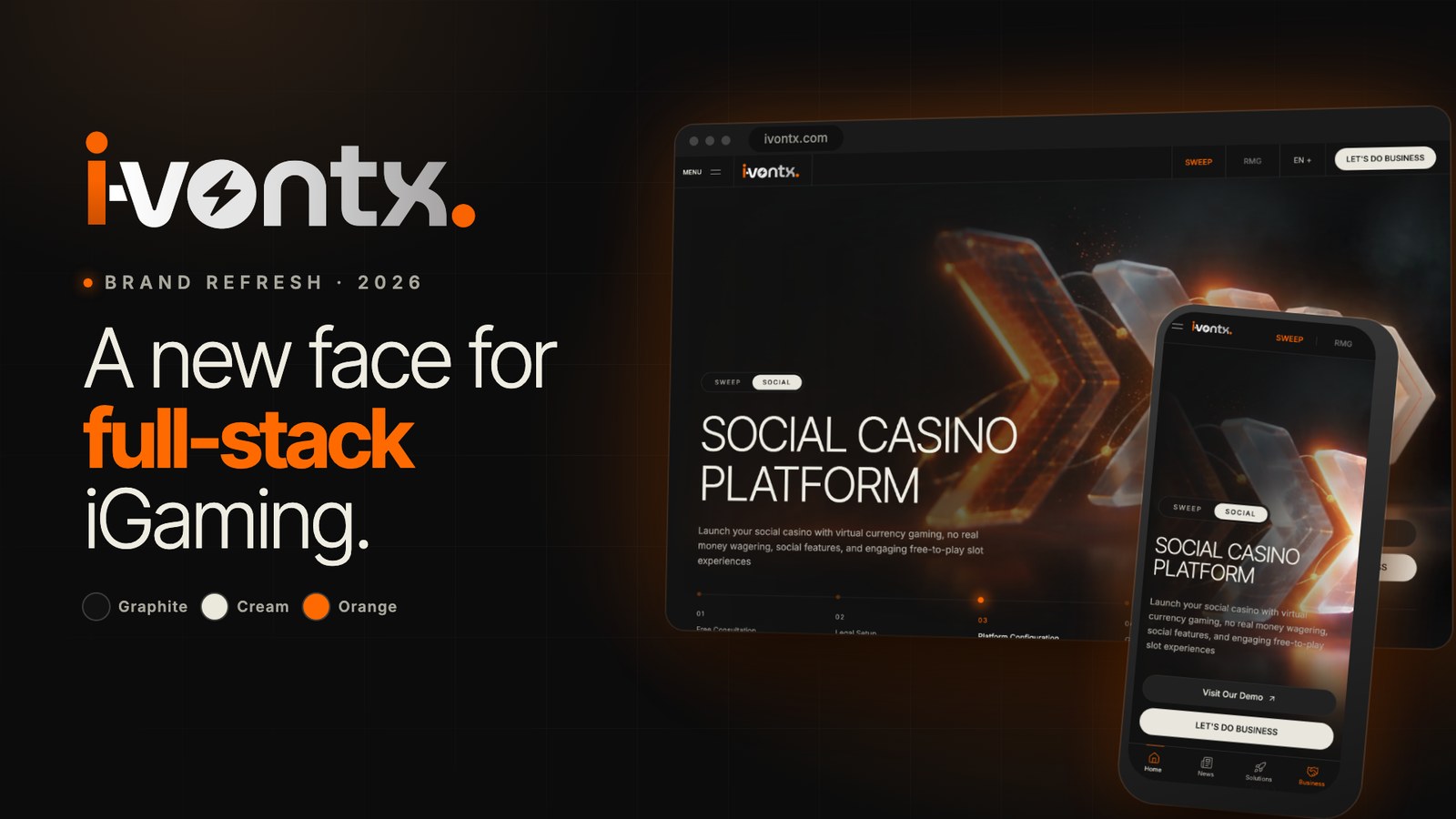
Today IVONTX is introducing a new brand identity: a redesigned logo, a new design system and a rebuilt website. The refresh reflects what the company has become: a full-stack iGaming technology partner covering sweepstakes, online casino, sportsbook, live casino, turnkey and white-label solutions, and now white-label poker.
Why We Refreshed the Brand
IVONTX started with a focused offer for the US sweepstakes market. Since then the platform has grown into a single technology stack that powers many different product types, jurisdictions and languages. The previous look no longer described that breadth or the level of polish partners expect from a technology provider.
The new identity is built around three ideas: one platform, clear presentation of every product, and a calm, confident visual language that lets the products speak.
The New Logo
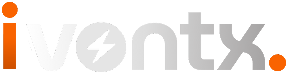
The new wordmark is custom lettered and keeps the name unmistakable. The most distinctive detail is the lightning bolt cut into the letter "o", a reference to speed, energy and real-time technology. The orange "i" and the orange full stop act as the brand accents and tie the wordmark to the rest of the design system.
The logo also exists in an animated version for the website and video: a light sweep passes across the letters and the bolt lights up once, then the mark returns to rest.
A New Design Language
The visual system is deliberately simple and consistent across every page:
- Color: graphite black, cream and a single orange accent taken from the logo.
- Typography: large, light headlines and a restrained text scale, so information is easy to scan.
- Rhythm: dark and white sections alternate in runs, with hairline grids and generous spacing.
- Product first: real product screens and purpose-made visuals replace stock imagery.
- Motion with restraint: animation supports comprehension and respects the reduced-motion setting on each device.
A Rebuilt Website
The website has been reorganised around what partners ask for most: the platform, the product range, licensing guidance, game providers and the onboarding process. Navigation works from a single menu on every screen size, and the mobile experience has its own simplified bar.
The site is now fully available in six languages: English, Hebrew, Spanish, Arabic, Russian and French. Hebrew and Arabic are displayed right to left, with mirrored layouts, dedicated typography and correct handling of mixed-direction text.
What Stays the Same
The refresh changes how IVONTX looks and presents itself, not what it delivers. The platform, the team, the focus on compliance and the commitment to partners remain exactly as they were.
Brand Assets
Partners and media who need the new logo files or brand guidelines can contact us at [email protected].